[you seem pretty sad] · packaging · ai art direction 00 2026

love, in three notes

you seem pretty sad.
[client]·
self-initiated · conceptual
[role]·
concept · label & packaging design · art direction · ai image direction
[deliverables]·
three labels · bottle packaging · campaign imagery
[year]·
2026 · packaging
[00.1] · key visual
01

the fragrances

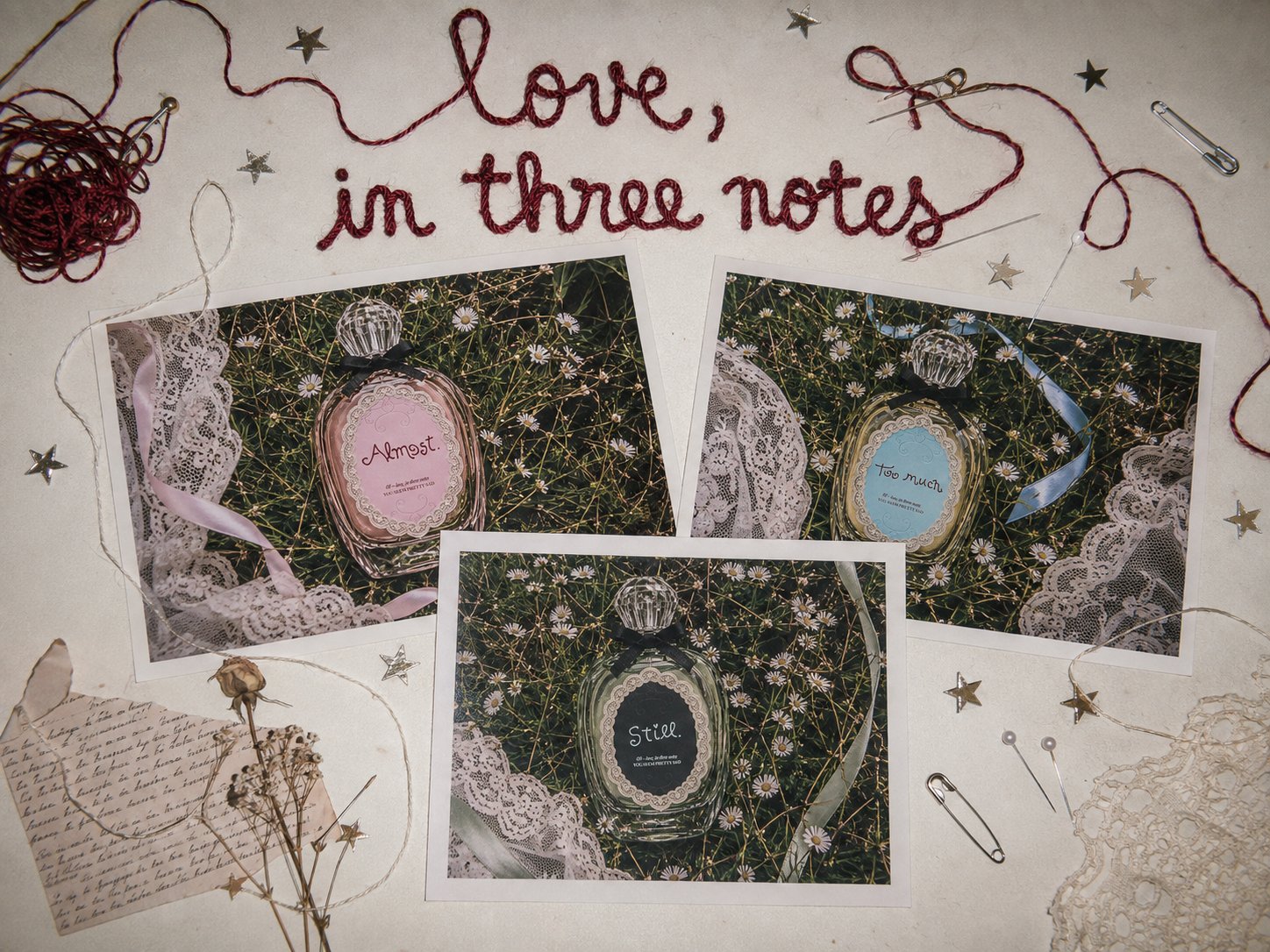
A conceptual fragrance collection built around three different emotional states of love: Almost. / Too much. / Still.

The project explores romance through nostalgia, intimacy and contradiction, taking inspiration from the emotional universe of adolescence: intense feelings, memories, vulnerability and the strange beauty of experiencing everything a little too much.

Each fragrance represents a different emotional note within the same story. Together they belong to the same intimate and romantic universe, while keeping their own identity through color, label details and imagery.

[keywords]· romance / nostalgia / intimacy / contradiction / adolescence / lace / film grain
[01.1] · the three labels
Almost.
[01.2] · 01 — almost.
Too much.
[01.3] · 02 — too much.
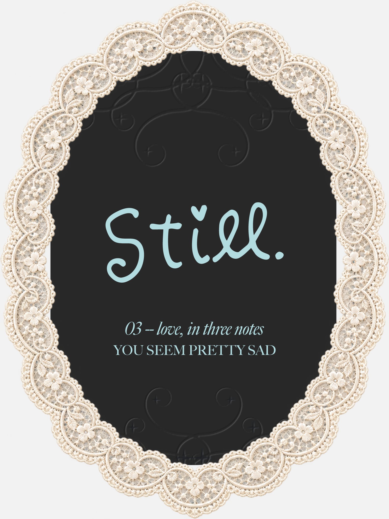
Still.
[01.4] · 03 — still.
02

label design

The label system combines delicate and ornamental elements with a more direct and contemporary visual language.

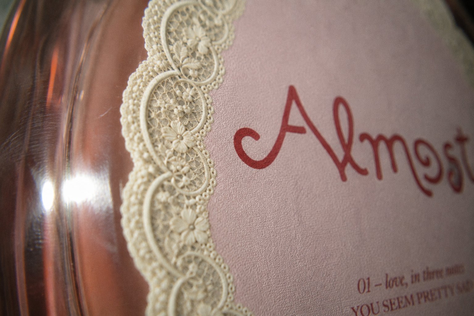
Lace-inspired borders, decorative details and typography create a romantic and nostalgic identity, while the black ribbon and the contrast between the three color variations keep the collection connected as one system.

Each label was designed as part of the same family while giving Almost., Too much. and Still. their own visual personality.

[02.1] · the collection as three posters
[02.2] · almost. — lace detail
[02.3] · too much. — label & ribbon
[02.4] · still. — dark variation
03

the product

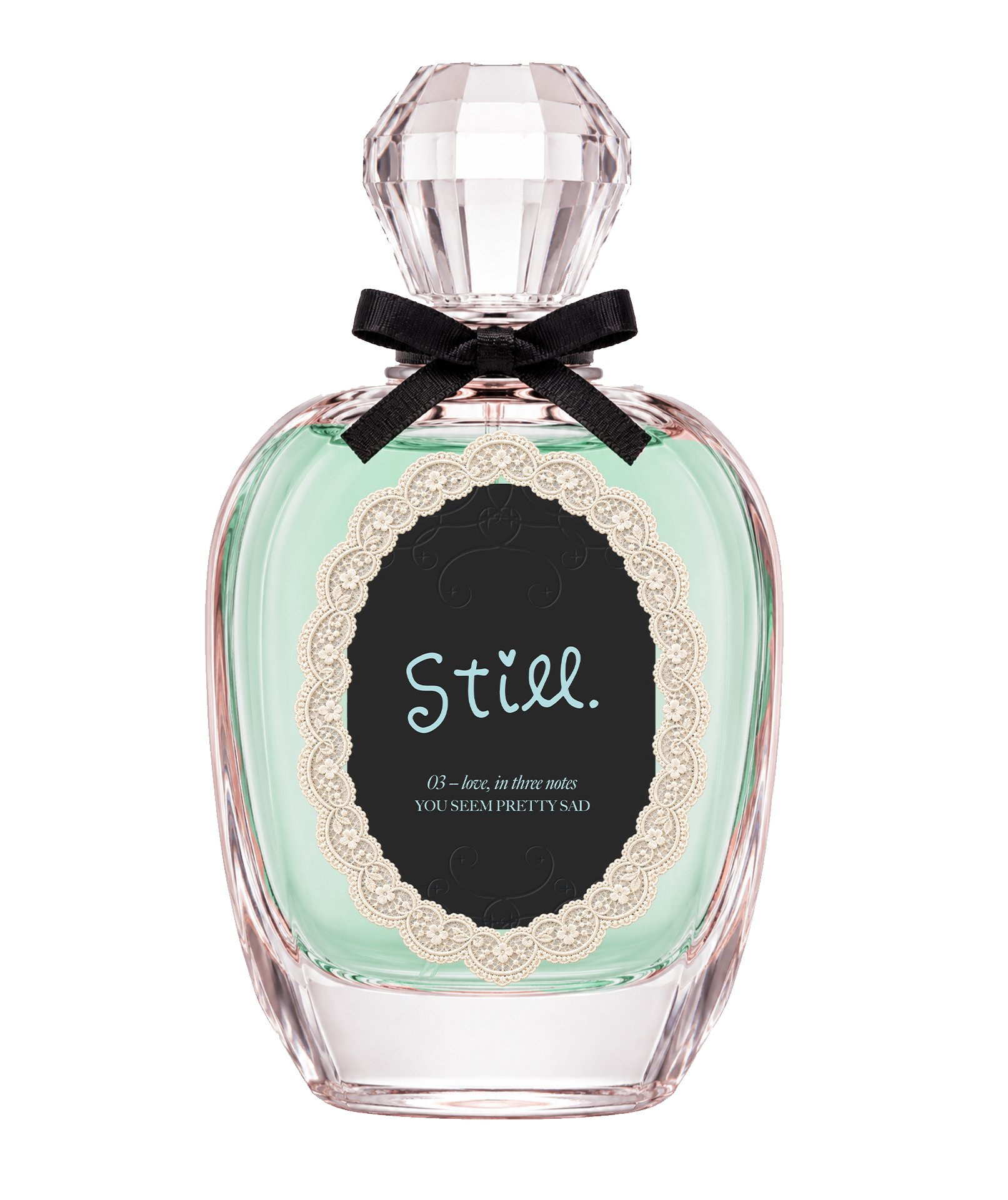
The packaging was designed to feel delicate, intimate and slightly nostalgic without becoming overly sweet.

Transparent glass, soft colors, ornamental labels and the black bow create a contrast between femininity and a darker, more emotional undertone.

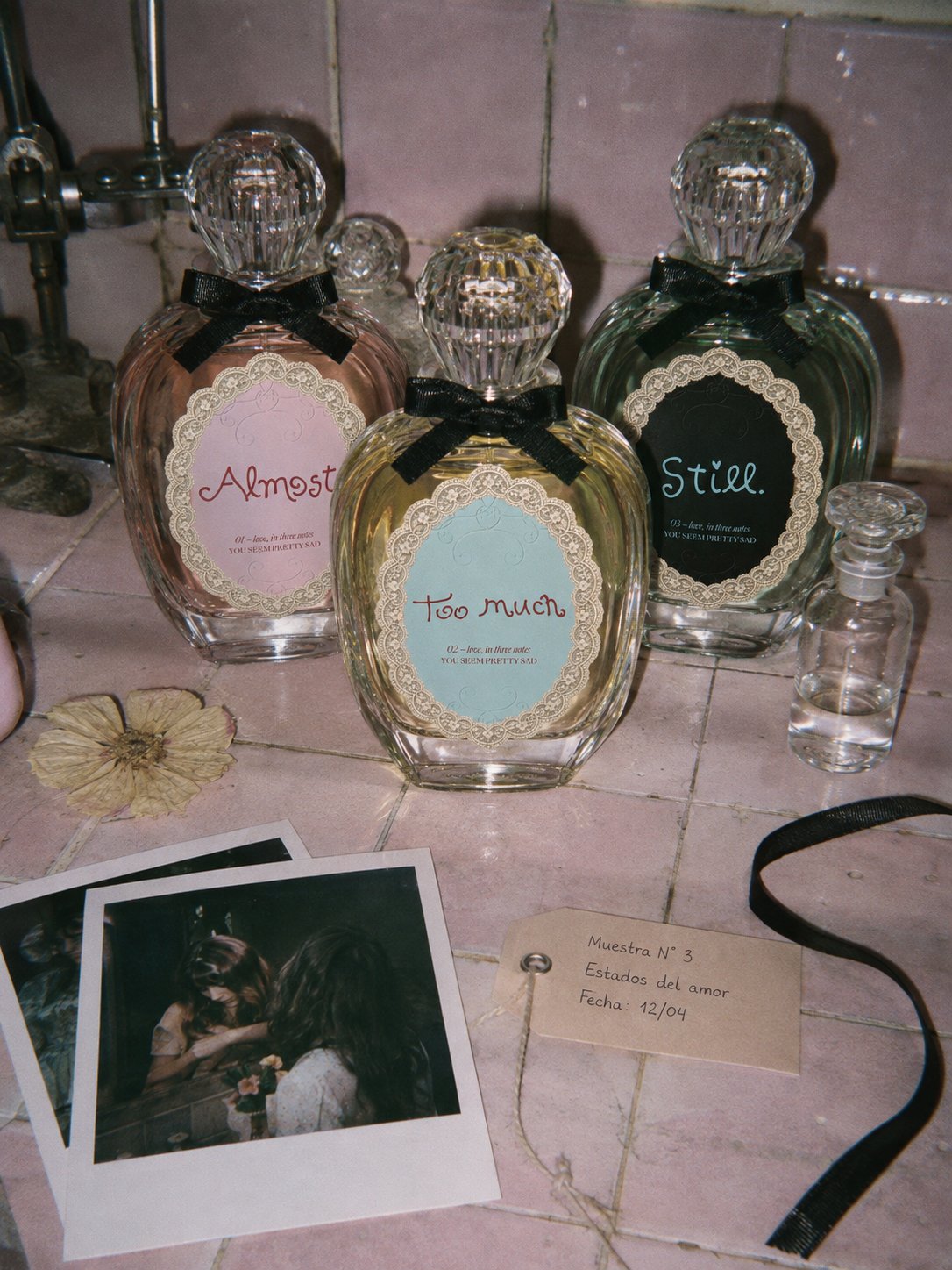
The three bottles work together as a collection, with each fragrance introducing its own color and personality into the system.

Almost.
[03.1] · 01 — almost.
Too much.
[03.2] · 02 — too much.
Still.
[03.3] · 03 — still.
[03.4] · the collection · sample nº3
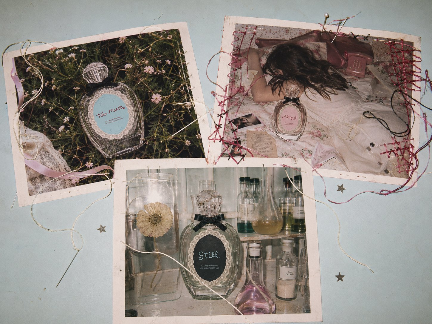
[03.5] · the three bottles — stitched print
04

ai art direction

The art direction expands the identity beyond the packaging and builds a complete photographic universe around the fragrances.

The campaign takes inspiration from teenage intimacy, romantic memories and the emotional contradictions of falling in love.

Instead of creating a perfectly romantic world, delicate elements coexist with something slightly strange, ordinary, clinical or imperfect.

romance, nostalgia & contradiction.

[04.1] · too much. — a bedroom floor
fresh flowers and wilted flowers.
soft fabrics and cold metal.
private bedrooms and direct flash.
nature and laboratory glassware.
[04.2] · three worlds, three notes
[04.3] · still. — laboratory glassware

the contrast is what gives the campaign its personality.

[04.4] · still. — pink apothecary
[04.5] · specimen · rosa alba · dehydrated
05

photography direction

like fragments from the same personal archive.

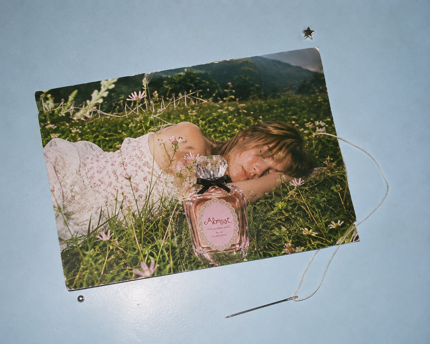
The photographic language was built around 35mm film, 90s compact cameras and instant photography.

Direct frontal flash, visible grain, imperfect focus, blown highlights and spontaneous compositions create images that feel physically photographed rather than digitally constructed.

The intention was not to recreate vintage photography through a filter, but to reproduce the imperfections and intimacy of a real personal archive.

[05.1] · too much. — sewn over the print
[05.2] · too much. — hand-stitched border
[method]· 35mm film · direct flash · organic grain · imperfect focus · personal archive
[05.3] · everything she kept · 16/6/97
[05.4] · almost. — a print, a needle, a star
next
ébène studio